Chop N' More Packaging
Product Packaging Design
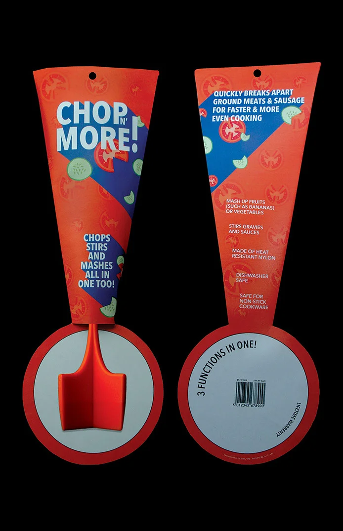
The Chop N' More packaging design was created to visually express energy, motion, and boldness—earning a Silver place and ribbon in the 2018 Indigo Design Awards for Packaging. Designed for a kitchen tool that chops fruits and vegetables, the packaging takes the form of an exclamation mark to emphasize both the excitement and function of the product. Diagonal lines and three-dimensional shadows enhance the sense of speed and loudness, while the bright orange color injects vibrancy and urgency. Minimal, functional illustrations demonstrate how the product works, paired with bold, all-caps typography for maximum visual impact. The final packaging includes precise die lines, trim marks, and measurements tailored to the product, and was fully assembled and photographed for presentation.
Overview:
Chop N’ More is a versatile kitchen tool designed for modern home cooks. The goal was to create packaging that stood out on retail shelves while instantly communicating the product’s multifunctionality for online shoppers.
Challenge:
Design packaging that balances visual appeal, clear functionality, and brand identity—ensuring it performs well in both physical and digital retail environments.
Insight:
Consumers make split-second purchase decisions based on packaging. To capture attention, the design needed to highlight usability and product benefits while maintaining a clean, premium look.
Solution & Concept:
I focused on a “Precision Meets Versatility” concept, combining a bold modern aesthetic with functional storytelling:
Clean typography for readability at a glance
Vibrant accents to guide the eye toward key product features
Instructional visuals that quickly demonstrate use
Packaging mockups optimized for e-commerce thumbnails and retail shelving
Impact:
The final packaging achieved a highly polished, functional, and market-ready look. By combining a strong visual hierarchy with persuasive messaging, the design enhances brand trust and improves the product’s competitive edge across sales channels.
full packaging designed, printed, cut, assembled, photographed by me
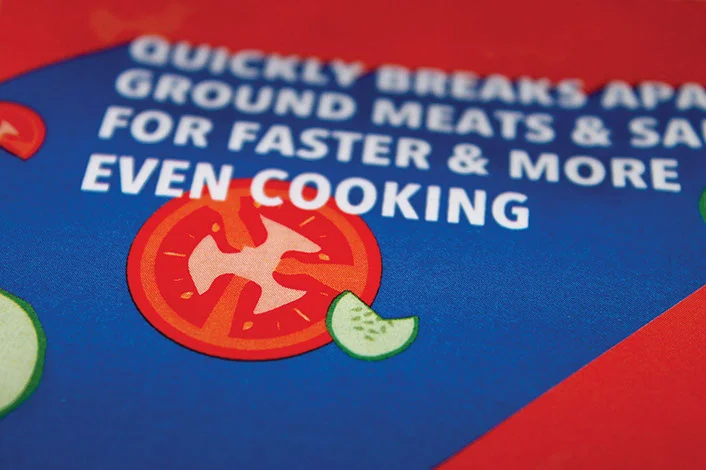
close up shop of chop n more packaging
close up shot 2 of chop n more packaging tomato and cucumber vegetables chopped
close up 3 back chop n more packaging with type and barcode


